Daughters of the Nile
Designing a bold, unapologetic cover that centres queerness, faith, and intergenerational rebellion.
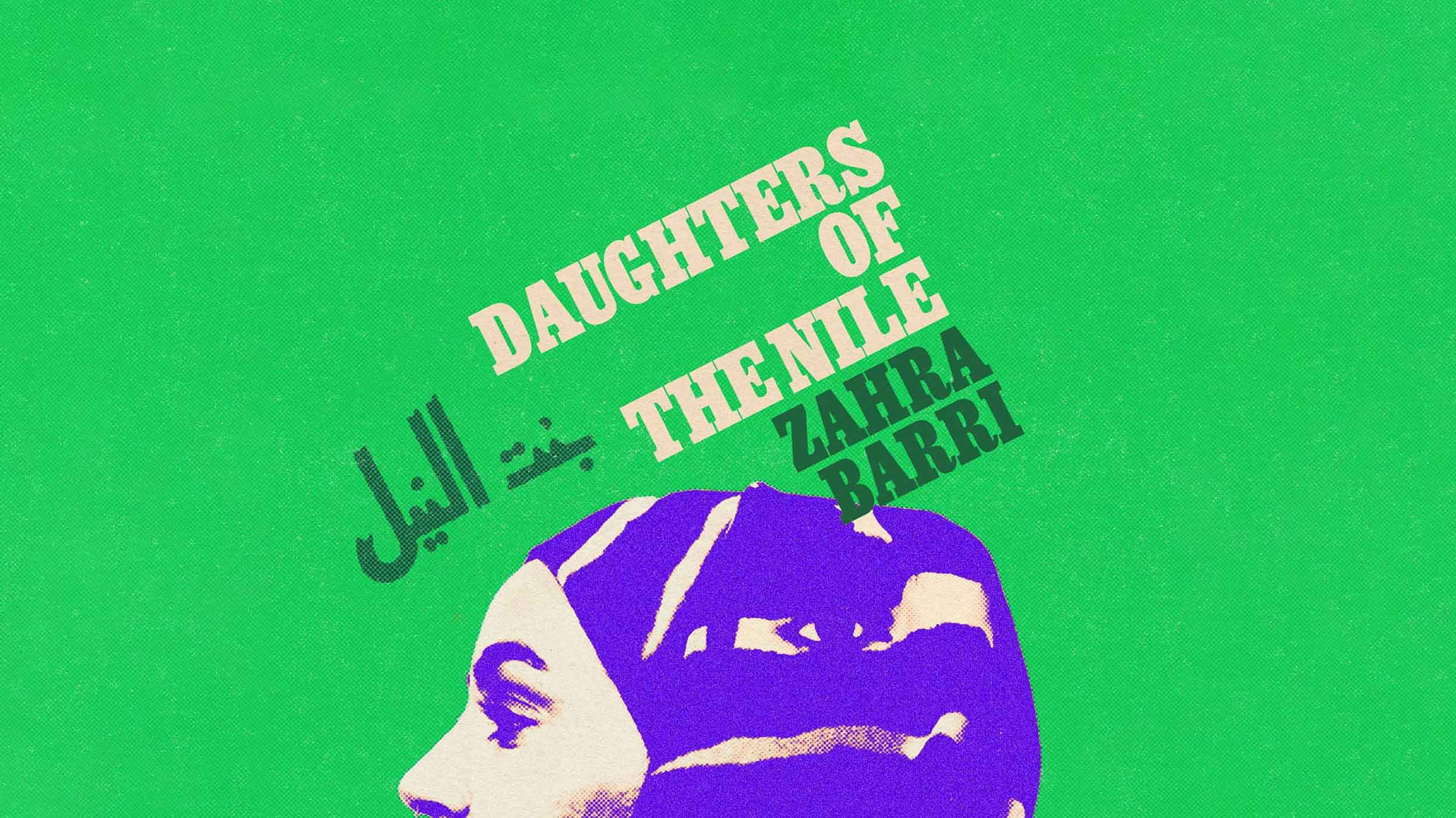
Cover design for Zahra Barri’s daring debut — a story spanning three generations of Egyptian women, from 1940s Cairo to 2010s Bristol. Bold, layered, and unafraid, the design reflects the book’s vibrant energy, celebrating sisterhood, sexuality, and struggle. It defies expectations by presenting a rich, complex narrative of Muslim women that moves beyond conventional representations of history and identity.


Imagery & Symbolism
Rooted in Feminine Strength and Revolutionary Spirit
I chose a striking photograph by Egyptian photographer Ismail Sabet — modern yet rooted in the visual language of the original Bint Al Nil magazine, reflecting Egypt's feminist legacy.
The composition places the youngest character at the forefront, with eyes emerging on each side — symbolising the wisdom and strength passed down through generations, and the protective familial gaze.
Typography
Bold, Revolutionary, and Empowering
Egyptienne Condensed Bold brings both weight and tension. Designed in the 1950s and revived during the 1970s liberation movements, it links two of the novel’s three timelines.
Originally marketed as an “Egyptian” typeface in the West, it connects the Western and Egyptian heritages of both the author and the book’s characters.
The bold, attention-grabbing font mirrors Zahra Barri’s fierce, unapologetic voice, embodying the defiance and empowerment central to the story.

Colour & Texture
Vibrant, Bold, and Queerly Empowered
The colour palette pulls from the bold, vivid tones of 1940s Egyptian and Iranian magazines, with a contemporary twist, incorporating colours from the bisexual flag to signal a vibrant queer energy.
I layered in textures that subtly evoke vintage print materials, bridging the past with the present while maintaining the design’s bold impact.