


Making a rukus!
Designing an identity rooted in Black Queer joy, creativity, and activism.
I led the full 2D design for Making a rukus!, creating an identity that reflects the archive’s unapologetic, vibrant spirit— rooted in Black Queer joy, creativity, and activism. Every design decision was made to celebrate these stories with energy, depth, and playfulness, bringing a sense of disruption to conventional narratives and embracing the boldness of the archive’s mission.


Title Treatment
Bold, Dynamic, and Playful
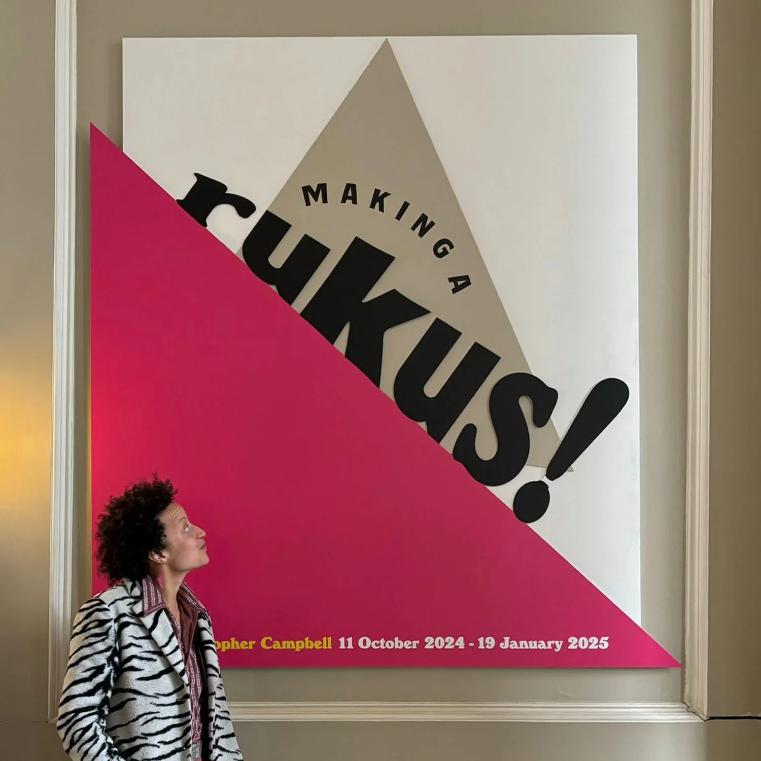
The title treatment was designed to create an energetic, bold statement with flexibility and movement at its core.
The design is playful with a mixture of fonts, representing the diversity and inclusivity within the Queer community — an intersection of voices, all contributing to one cohesive narrative.
The word ‘rukus!’ expands in size, towards the larger and more prominent, ‘US’ forming a triangular shape, and symbolising community, pride, and a growing sense of collective strength.
The title panel was laser cut with large, three-dimensional letterforms layered over dynamic triangles, breaking from traditional rectangular forms to create something bold and disruptive.
Colour Palette
Vibrant, Saturated, and Joyful
Inspired by the vibrant and bold aesthetics found in the rukus! archive.
Drawing from the iconic rukus! pink and colours used by the Black Perverts Network — a radical group that celebrated Black Queer sexuality, kink and community on its own terms.
The palette includes Pink, Yellow, Blue, with accents of Black.
These colours bring a celebratory, joyful, and humorous tone to the exhibition, making the experience visually engaging and emotionally resonant.


Typography
Rooted in Resistance, Queerness and Connection
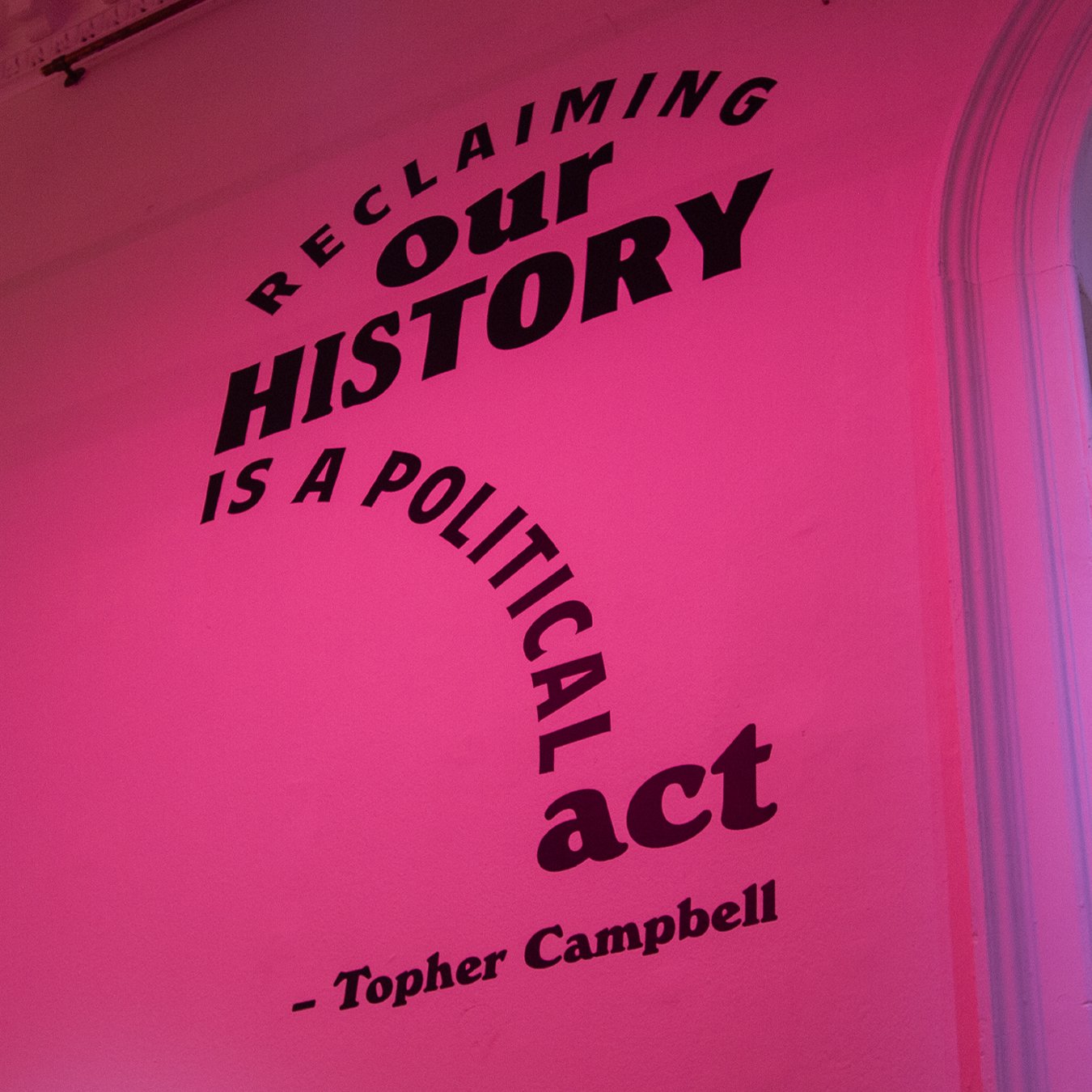
The Windsor Ultra Heavy font — which was used by both the Black Liberation Front and Gay Liberation Front in 70s Britain — ties the design directly to a legacy of protest, pride and radical imagination.
Layered with more modern, flexible typefaces, the typography creates an intergenerational conversation — connecting past, present and future.
Varying fonts within words mirror the range of identities within the Queer community — embracing difference, holding space for individuality and collective power.
I played with curves, angles and movement across the wall quotes to reflect the rhythm and dynamism of Black Queer life.
It’s playful, bold and intentionally unruly — just like the archive itself.
Symbolism and Layering
Triangles as Symbols of Resistance and Pride
A key feature of the design was the use of triangles throughout — referencing the pink triangle, a reclaimed symbol of Queer resistance and pride.
Triangles were layered throughout to disrupt traditional exhibition layouts — laser-cut shapes placed over graphic illustrations referencing both Gay and Black symbols, including same-sex gender symbols, African fertility dolls and the original rukus! icon.
This layering helped tie together the wide range of materials within the archive, while visually representing the intersecting identities the exhibition explores.
The lighting designer brought these forms to life, casting the rooms in coloured hues and illuminating white triangles across the walls — creating shifts in tone and texture that amplified the symbolism and atmosphere.
